Difference between revisions of "PicEdit Tutorial"
| (16 intermediate revisions by the same user not shown) | |||
| Line 1: | Line 1: | ||
| − | + | [[Tutorials and Guides|Tutorials and Guides Table of Contents]]<br /> | |
| − | == Setting up the Picture == | + | |
| + | |||
| + | <div align="center"><span style="font-size: 22pt">Vortex AGI Tutorials</span><br /> | ||
| + | ''By [[Kon-Tiki]]''</div> | ||
| + | |||
| + | | ||
| + | |||
| + | == <br />Setting up the Picture == | ||
=== Plan the composition === | === Plan the composition === | ||
| Line 7: | Line 14: | ||
{| | {| | ||
| | | | ||
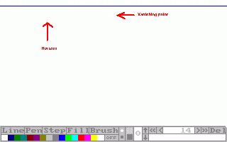
| − | First thing you should do is find out what should be on your picture. What should be in the background, what in the foreground, etc. Then comes the first thing you do in | + | First thing you should do is find out what should be on your picture. What should be in the background, what in the foreground, etc. Then comes the first thing you do in PicEdit (except for opening it and starting a new picture) is setting the horizon. Draw the line where the horizon should be and remember the Y- coordinate. Then set the vanishing point. The vanishing point is the place where everything tends to disappear in if you draw the lines far enough. |
''Some tips'' | ''Some tips'' | ||
| Line 14: | Line 21: | ||
* The higher the vanishing point, the lower you're standing. | * The higher the vanishing point, the lower you're standing. | ||
| | | | ||
| − | [[Image: | + | [[Image:PicEdit tutorial 1.gif|320px|Click to enlarge.]] |
|} | |} | ||
| Line 20: | Line 27: | ||
{| | {| | ||
| − | | | + | |- |
| + | |width="90%"| | ||
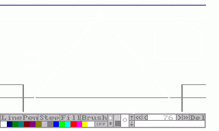
Second thing that needs to be done, is setting up the composition. Draw boxes where you want everything to be. | Second thing that needs to be done, is setting up the composition. Draw boxes where you want everything to be. | ||
| Line 27: | Line 35: | ||
* If you want cavelike borders or such things, draw in dark/light gray. That way, it won't become confusing. | * If you want cavelike borders or such things, draw in dark/light gray. That way, it won't become confusing. | ||
* Try to keep the coordinates and priority lines in mind. | * Try to keep the coordinates and priority lines in mind. | ||
| − | | | + | |width="320px"|[[Image:PicEdit tutorial 2.gif|320px]] |
| − | [[Image: | ||
|} | |} | ||
| Line 35: | Line 42: | ||
{| | {| | ||
| | | | ||
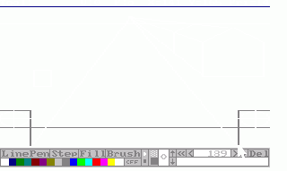
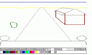
| − | This's easy and done really fast. Just draw lines from the corners of the boxes that aren't round surfaces. Make sure not to draw the line that runs through the box, unless the object in it will be | + | This's easy and done really fast. Just draw lines from the corners of the boxes that aren't round surfaces. Make sure not to draw the line that runs through the box, unless the object in it will be transparent. When that's done, draw the lines where the object should stop. Make sure that these lines run exactly the same as the lines a bit further on (like the roof in the example). |
''Some tips'' | ''Some tips'' | ||
| Line 41: | Line 48: | ||
* To draw halve/full circles, draw a cross in the middle of the box and draw curves from one point of it to the next using the pen tool. This's a bit tricky and demands lots of exercise. The main idea is to mirror the pixels over the line of the cross. | * To draw halve/full circles, draw a cross in the middle of the box and draw curves from one point of it to the next using the pen tool. This's a bit tricky and demands lots of exercise. The main idea is to mirror the pixels over the line of the cross. | ||
| | | | ||
| − | [[Image: | + | [[Image:PicEdit tutorial 3.gif|320px|]] |
|} | |} | ||
| − | == The | + | == The Actual Picture == |
| − | === Drawing the | + | === Drawing the Outlines === |
{| | {| | ||
| | | | ||
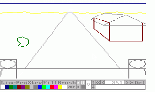
| − | Now the time's come to draw the actual picture. Draw the lines according to the frame you've set up. Choose the | + | Now the time's come to draw the actual picture. Draw the lines according to the frame you've set up. Choose the color you want and don't mind the priorities yet. If you have some curved lines, draw them according to the lines you've set up, but you can stray a bit off. Remember: those black lines Are just guidelines. Be sure to draw every line. If a line should be black, draw over it. |
''Some tips'' | ''Some tips'' | ||
* To outline smaller details in the larger ones, just set boxes for them again. | * To outline smaller details in the larger ones, just set boxes for them again. | ||
| − | * To change the | + | * To change the color of a half/full circle, go back into the history and change it. |
| | | | ||
| − | [[Image: | + | [[Image:PicEdit_tutorial_4.gif|320px|]] |
|} | |} | ||
| Line 64: | Line 71: | ||
{| | {| | ||
| | | | ||
| − | It's best you get rid of those ugly black lines now. Go to the beginning of the history (press 'HOME') and delete (press 'DEL') everything until only the | + | It's best you get rid of those ugly black lines now. Go to the beginning of the history (press 'HOME') and delete (press 'DEL') everything until only the colors remain. |
''Some tips'' | ''Some tips'' | ||
| Line 70: | Line 77: | ||
* Make sure you save your picture before doing this. It's not very fun to see that you've deleted a bit too much. | * Make sure you save your picture before doing this. It's not very fun to see that you've deleted a bit too much. | ||
* Going to the end of the frame-setting and working backwards can prevent some problems. | * Going to the end of the frame-setting and working backwards can prevent some problems. | ||
| − | * Be aware if you've changed | + | * Be aware if you've changed colors by using the history (f.e. for circles) that you don't delete them too. |
| | | | ||
| − | [[Image: | + | [[Image:PicEdit tutorial 5.gif|320px|]] |
|} | |} | ||
| Line 79: | Line 86: | ||
{| | {| | ||
| | | | ||
| − | This | + | This Is the moment we've all been waiting for. You're going to add the 'Sierra-touch'. The trick is to use the darker or lighter version of a color. Draw it a bit from the border and make it a whole. Fill it, then fill the rest. It's as simple as that. Same thing's for shading, but the border color should be the color of the shade then and the relief in the shaded part should have the darker version of the not-shaded color. |
''Some tips'' | ''Some tips'' | ||
| − | * Try extracting some | + | * Try extracting some pictures from Sierra and go through their history or look at the things you want to use but can't get to work. |
* Imagine a point from where all light comes. Draw the lighter parts there and the shadows on the other side. | * Imagine a point from where all light comes. Draw the lighter parts there and the shadows on the other side. | ||
| − | * Now it's a good time to save the | + | * Now it's a good time to save the picture. |
| | | | ||
| − | [[Image: | + | [[Image:PicEdit_tutorial_6.gif|320px|]] |
|} | |} | ||
| Line 101: | Line 108: | ||
You can add more details than this in this picture. That's all up to your imagination. | You can add more details than this in this picture. That's all up to your imagination. | ||
| + | |||
| + | | ||
| + | |||
| + | [[Tutorials and Guides|Tutorials and Guides Table of Contents]] | ||
| + | |||
| + | | ||
[[Category:Tutorials]] | [[Category:Tutorials]] | ||
Latest revision as of 15:20, 28 December 2013
Tutorials and Guides Table of Contents
Setting up the Picture
Plan the composition
|
First thing you should do is find out what should be on your picture. What should be in the background, what in the foreground, etc. Then comes the first thing you do in PicEdit (except for opening it and starting a new picture) is setting the horizon. Draw the line where the horizon should be and remember the Y- coordinate. Then set the vanishing point. The vanishing point is the place where everything tends to disappear in if you draw the lines far enough. Some tips
|
Setting up the composition
Setting the perspective
|
This's easy and done really fast. Just draw lines from the corners of the boxes that aren't round surfaces. Make sure not to draw the line that runs through the box, unless the object in it will be transparent. When that's done, draw the lines where the object should stop. Make sure that these lines run exactly the same as the lines a bit further on (like the roof in the example). Some tips
|
The Actual Picture
Drawing the Outlines
|
Now the time's come to draw the actual picture. Draw the lines according to the frame you've set up. Choose the color you want and don't mind the priorities yet. If you have some curved lines, draw them according to the lines you've set up, but you can stray a bit off. Remember: those black lines Are just guidelines. Be sure to draw every line. If a line should be black, draw over it. Some tips
|
Removing the frame
|
It's best you get rid of those ugly black lines now. Go to the beginning of the history (press 'HOME') and delete (press 'DEL') everything until only the colors remain. Some tips
|
Adding a Sierra-touch
|
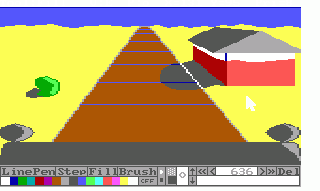
This Is the moment we've all been waiting for. You're going to add the 'Sierra-touch'. The trick is to use the darker or lighter version of a color. Draw it a bit from the border and make it a whole. Fill it, then fill the rest. It's as simple as that. Same thing's for shading, but the border color should be the color of the shade then and the relief in the shaded part should have the darker version of the not-shaded color. Some tips
|
Adding the priorities
Now go through the history and add the priorities to the drawing actions of the other parts. This way, you'll save a lot of time you'd waste by tracing. It's also far more accurate.
Some tips
- Try to find the best action to add a certain priority action to.
End result
You can add more details than this in this picture. That's all up to your imagination.
Tutorials and Guides Table of Contents
